Colors, Inspired from Life
Disclaimer: I've grown up a bit and learned a lot since this blog was started. In the beginning I took tips from the likes of John Chow and Shoemoney and tried to write titles and content for Digg and Reddit. In the end it didn't do me much good and most of it just seems silly looking back. If you're interested anyway, here's what I wrote back then, but take it with a grain of salt.
Yesterday I listed quite a few sites from which I picked a few aspects of design that I liked. I was looking more towards the layout and feel than the color but I did note a few palettes that I liked. Yesterday evening I was shopping in my local Old Navy and I noticed the colors being used in the decorations for the men’s side of the store. A solid brown wash with blue and white “boxes” and orange circles. I liked it so I snapped a quick picture with my phone and after playing for a while with different shades I came up with something like this.
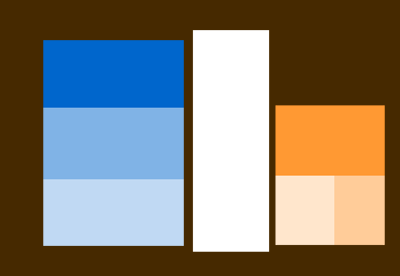
It’s pretty abstract for now, and it doesn’t offer any of the texture or depth I’m looking for, but as a palette, I’m very happy.
To add to my list from yesterday, I love the footer on Design View and 5thirtyone’s homepage is amazing (Derek Punsalan’s portfolio is also very impressive, I love the header and footer, but they’re not really what I’m looking for). Of course since I’m considering brown, I have to mention UnstoppableRobotNinja for its layout and sort-of brownish color scheme and Jeff Croft for his recent redesign and advocation of brown websites.